

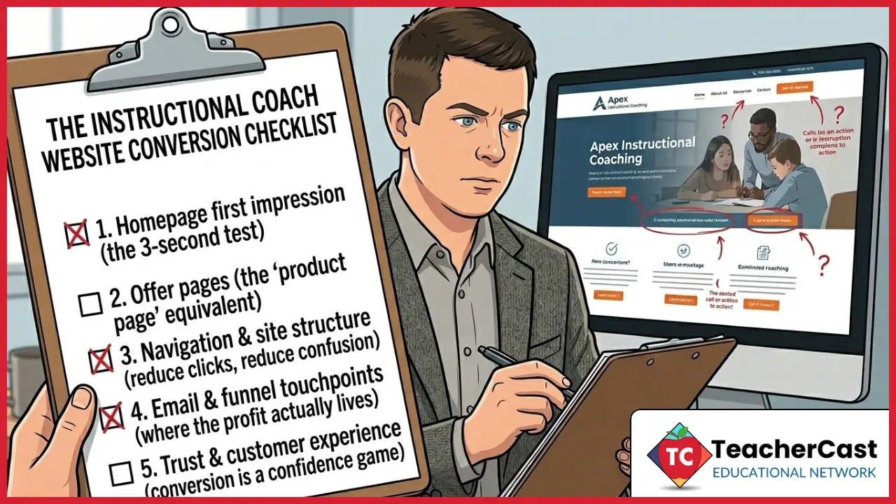
If you’re an instructional coach building a side hustle (or trying to grow your edu brand into one), your website probably isn’t “broken.” It’s just unclear — and when a site is unclear, people don’t lean in. They bounce.
This instructional coach website checklist is the fix. It helps you tighten your message, choose one primary call-to-action, and turn your website into a clear “next step” engine.
Unclear doesn’t just hurt your ego. It quietly hurts your newsletter growth, your bookings, and your ability to turn good work into momentum—because your best-fit visitors can’t quickly tell what you do, who it’s for, and what to click next.
This post was inspired by an e‑commerce conversion audit i recently read, but the underlying framework works for instructional coaches too: get the right person to take the right next step.
Key takeaways (quick answers)
- Your homepage should answer who you help + what you do + what to click next in 3 seconds.
- Every page needs one primary CTA (sign up for a coaching cycle, schedule a meeting, etc)
- Email is the compounding asset: a lead magnet + 3-email welcome flow is enough to start.
- If your navigation feels like a menu of everything you’ve ever done, teachers will pick nothing.
Fast path: Use the checklist below, then fix the first 3 “No’s” you find.
A quick story: my first coaching website
When I built my first coaching website, I did what a lot of coaches do: I tried to include everything. I wrote pages for every teacher, administrator, para, and office member. I added buttons for every application I could think of. And I assumed people would “click around” and figure it out.
Here’s what actually happened. People visited…and bounced. The few who stayed asked questions the homepage should have answered. And the best opportunities for me in the classroom still came through word-of-mouth, not the site.
The lesson was simple (and a little painful): my website wasn’t guiding people—it was dumping information on them.
Once I tightened the message, chose one primary call‑to‑action, and built a basic email welcome flow, things started to click. Not because the site looked fancier—because it finally did one job well: help the right person take the next step.
For an instructional coach, the “conversion” might be:
- joining your coaching newsletter
- downloading a free resource / toolkit
- registering for a personalized PD session
- booking 1:1 coaching or consulting
- contacting you about a coaching cycle or PD
Below is a coach‑friendly checklist you can run in an afternoon (and then improve weekly).
What to do first (so this doesn’t become “just another audit”)
Pick one primary conversion goal for your site (don’t try to do everything at once):
- Email list growth: newsletter + lead magnet as the hub
- Bookings: coaching/consulting calls as the primary CTA
- Speaking/PD: inquiry form as the primary CTA
Then run this in order:
- Homepage clarity
- Offer / landing pages
- Navigation & site structure
- Email funnel touchpoints
- Trust & customer experience
Most sites try to fix everything at once. That’s how audits die. Focus on the parts that compound.
1) Homepage first impression (the 3‑second test)
The 3 questions every homepage must answer fast
Within 3 seconds, can a visitor say:
- Who is this for? (teachers, coaches, school leaders, districts)
- What do I get here? (systems + toolkits that save time and boost classroom impact)
- What should I do next? (one clear CTA)
Homepage upgrades to prioritize (coach edition)
- Above the fold headline: outcome‑first + audience named (ex: “I help K–12 teachers simplify tech workflows in 10 minutes a day.”)
- Primary CTA: pick ONE
- “Get the free toolkit”
- “Join the newsletter”
- “Book a call”
- “Start here”
- Support CTA: one secondary link at most (podcast, YouTube, or your best resource).
- Trust signals above the fold: school/district experience, certifications, testimonials, conference sessions, podcast appearances, or published work.
- Mobile speed: aim for
Quick score: If your homepage has more than one “main” button competing for attention, your visitor will choose… nothing.
2) Offer pages (the “product page” equivalent)
A course page, template page, toolkit landing page, workshop registration page, and even a “speaking” page are all product pages.
The fastest way to improve conversion on offer pages
Move from features → outcomes → proof → friction removal.
Use this structure:
- Promise: “In 30 minutes, you’ll be able to…”
- Who it’s for / not for
- What you’ll learn / get (bullets)
- What it looks like (screenshots, sample pages, preview video)
- Proof: testimonials, results, credibility
- FAQ: answer the objections before they form
- CTA: repeated, consistent
Offer page checks (coach edition)
- Are you writing to a real pain point (time, overwhelm, adoption, teacher buy‑in, workflow chaos)?
- Do you show proof (screenshots, sample pages, examples, testimonials)?
- Is there a “first 10 minutes” path so it feels easy to start?
- If your offer is speaking/PD/coaching: do you list outcomes, audience types, what happens next, and a simple inquiry form?
3) Navigation & site structure (reduce clicks, reduce confusion)
Navigation isn’t a design preference. It’s a conversion system.
A simple rule
A visitor should be able to reach the primary conversion goal in two clicks or less.
Fixes to run
- Keep top navigation under 6 links.
- Use one “Start Here” page per site.
- Add a visible search (especially on TeacherCast).
- Footer should include essentials:
4) Email & funnel touchpoints (where the profit actually lives)
Even if you’re not “selling,” email is where you build relationship, consistency, and repeat traffic.
Minimum viable email system (do this before fancy funnels)
- 1 strong opt‑in (sitewide visible)
- 1 lead magnet tied to a real pain point
- 3‑email welcome flow:
- Deliver + quick win
- “Here’s how I think about this system” (teach the framework)
- Next step (resource / playlist / offer)
Make the thank‑you page do work
After a signup or download:
- confirm what they’ll get + when
- tell them what to do next (watch/read/listen)
- one CTA only
5) Trust & customer experience (conversion is a confidence game)
Visitors buy (or subscribe) when they feel:
- “This is for me.”
- “This is credible.”
- “This is easy.”
Trust upgrades to prioritize
- About page feels personal and current (human, not corporate).
- Policies / contact info are easy to find.
- Show real humans behind the brand (photo, story, clear identity).
- Remove friction on forms (shorter fields, clear expectations).
Want weekly side‑hustle friendly coaching systems?
If you’re building an instructional coaching brand, you don’t need more “marketing hacks.” You need a simple system you can run consistently.
Join my newsletter and I’ll send you:
- quick website + email improvements you can do in under 30 minutes
- real examples from coaching work (what worked, what flopped, what I’d do again)
- templates and checklists you can copy/paste
Sign up here: https://www.teachercast.net/newsletter
After you sign up, hit reply and tell me what your website is trying to help people do (book you, join your list, or buy an offer). I’ll tell you the one area I’d tighten first.
FAQ: instructional coach website checklist
What should an instructional coach put on their homepage?
Your homepage needs three things above the fold: who you help, the outcome you deliver, and one clear button for the next step. Add one trust signal (role, district experience, certification, or testimonial) so people feel safe clicking.
Do instructional coaches need a newsletter?
No—but it’s the simplest way to turn a one-time visitor into a repeat visitor. A newsletter also gives you a consistent place to send people after PD sessions, workshops, or podcast appearances.
What’s the best first lead magnet for coaches?
Start with one resource that solves one real problem in 10–15 minutes (a checklist, template, or “swipe file”). Make it directly connected to what you want people to do next (book you, buy a template, or join a workshop).
How many pages should a coaching website have?
You can start with 4: Home, Start Here, Work With Me (or Resources), and About. Add pages only when you have a clear reason and a clear next step.
What should I put on a “Work with me” page?
Lead with outcomes (what changes for the teacher/school), show proof (testimonials/examples), list what’s included, answer FAQs, and end with one CTA (book a call or submit an inquiry).
Build Classroom Systems That Actually Work
Cut the tech overwhelm today. Download a free chapter of Impact Standards
and receive a weekly digital learning playbook.
